







The place where a product is made can lend it authenticity, while an overly “human” brand may make price increases harder to accept. Typography matters too: fonts that resemble handwriting can encourage emotional engagement and influence consumer choice.
What makes a brand authentic, human and trustworthy? The answer depends on more than the product’s objective quality. Where it is made, how the brand presents itself and even the typeface used on its packaging can shape consumer perceptions.
These are the findings of a review of academic studies featured by Europanel in its Pick of the Week newsletter. The research examines three aspects relevant to the fresh produce sector and the berries market: authenticity associated with the place of production, brand anthropomorphism and the use of fonts that resemble handwriting.
The place of production becomes part of the brand’s identity
As a brand grows, it may decide to move production or add facilities in new locations. It may do so to reduce costs, increase capacity or move closer to its target markets.
The decision may make sound industrial and logistical sense. Consumers, however, do not always respond favourably. According to research published in the Journal of Marketing Research, learning that a product is not made in the place regarded as the brand’s “original” home can reduce its perceived value and consumers’ willingness to pay.
The effect is particularly relevant to brands strongly associated with a particular place. Consumers may expect, for example, Levi’s jeans to come from San Francisco, Guinness to be brewed at the historic St James’s Gate brewery in Dublin, or Godiva chocolate to be made in Belgium.
The researchers suggest that the original production site transfers some of the brand’s “essence” to the product. Origin thus acts as a form of symbolic transfer of authenticity: something made where the brand began appears more faithful to its history and, consequently, more valuable.
An advantage worth communicating in fresh produce
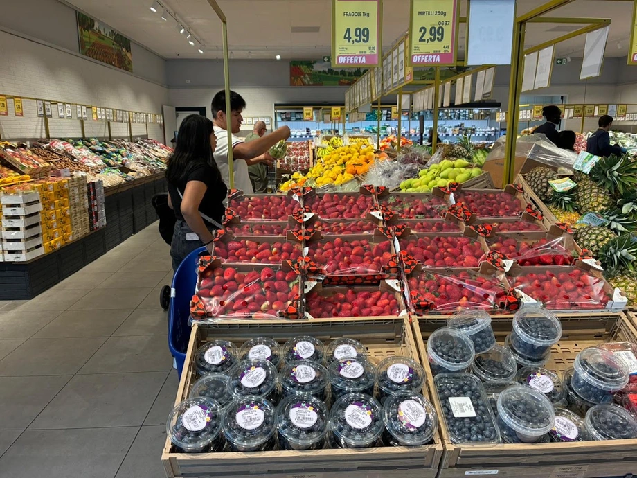
This principle may have important applications along the berries supply chain. Fruit grown in the area where a company was founded, or packed at its original facility, may benefit from a story built around experience, specialisation and continuity.
Statements such as “grown on our farm since…”, “harvested and packed in…” or “produced in our home region” can therefore do more than provide geographical information. When supported by verifiable facts, they help communicate expertise, local roots and authenticity.
For growers of blueberries, raspberries, blackberries or strawberries, the growing region can become an integral part of the value proposition. This is particularly true when local growing conditions, production traditions or people’s experience have a tangible influence on the fruit’s characteristics.
References to origin must, however, be clear. A brand that uses images, names or symbols strongly associated with one region while selling fruit from other areas risks creating a gap between expectation and reality. Fruit from abroad does not necessarily weaken trust; the problem is the impression that the brand is suggesting an origin different from the product’s actual one.
A more human brand can make price increases harder to accept
A second study highlighted by Europanel concerns brand anthropomorphism: attributing human characteristics, intentions or behaviour to a brand.
This is a widespread strategy. Illustrated characters, mascots, faces, personal names and packaging that seems to “speak” directly to consumers are all used to make a brand feel closer and more recognisable. Even the front of a car can resemble a face, while characters representing a product or company are common in consumer goods.
This closeness can have an unintended consequence. The study, published in the Journal of Marketing, shows that consumers may respond more negatively to a price increase when a brand is strongly humanised.
Consumers seem to judge the brand almost as they would a person. If it is seen as friendly and approachable, a price increase may feel less like an impersonal market decision and more like an intentional act that calls the relationship of trust into question.
The research also found greater price sensitivity towards humanised brands, with a particularly negative response among the men who took part in the experiments.
Explain why the price is changing
Transparency therefore becomes even more important for companies that communicate in a familiar, personal way or place growers at the centre of their branding. When a price change is necessary, it may help to explain the reasons behind it: production costs, labour, weather conditions, quality selection, packaging materials or environmental investments.
The issue is especially relevant to berries, a sector with high costs and considerable variation in production. A brand that shows the faces and work of its growers creates an emotional connection, but also raises expectations of fairness. Promotional messaging alone may therefore be insufficient when prices rise.
Humanising a brand remains a powerful tool, particularly for emerging brands and farms seeking to stand out on the shelf. It should, however, be accompanied by a consistent story that explains both who produces the fruit and how its value is created.
Handwriting-style fonts increase engagement
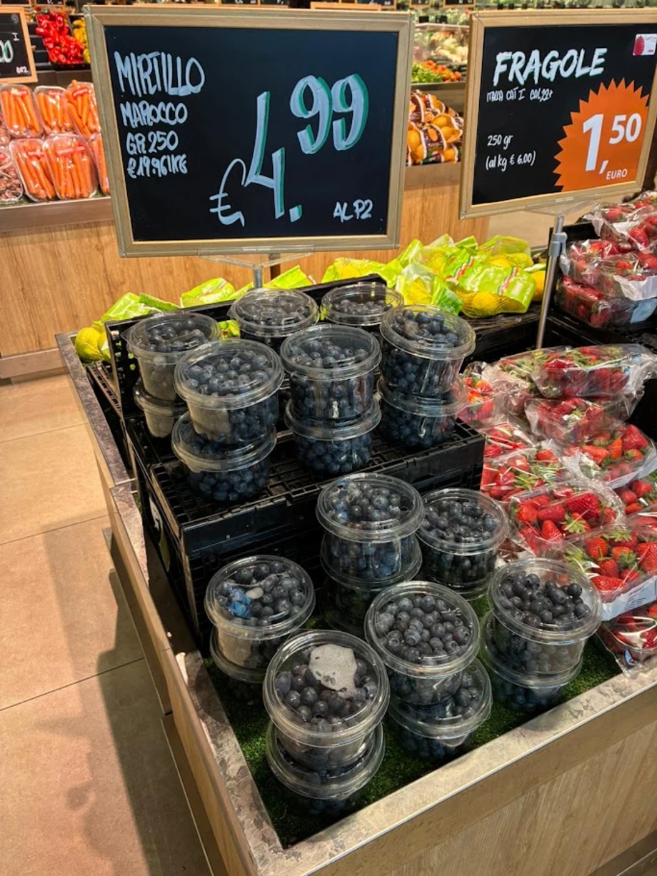
The third study examines a seemingly minor packaging element: typography. More and more producers use fonts that resemble handwriting to convey craftsmanship, spontaneity and a human touch.
Research published in the Journal of Consumer Research indicates that this choice can affect purchasing behaviour. In the tests examined, products with handwriting-style fonts on their packaging were purchased more frequently than identical products presented in conventional, machine-like typefaces.
In one experiment, 30% of participants bought a crispbread product packaged with a handwriting-style font, compared with just 6% for the identical product with a conventional typeface.
Products bearing text that appeared to be handwritten also received more favourable evaluations. According to the researchers, these fonts signal a human presence and make it easier to form an emotional connection with the product.
Emotion or function: typography should match the positioning
The effect is not the same across all product categories. When a product promises pleasure, flavour and sensory enjoyment, handwriting-style typography may make it more appealing. A more regular, “mechanical” typeface may be better suited to positioning based on functionality, precision and performance.
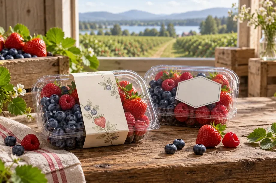
In the berries market, a handwriting-style font could help communicate sweetness, naturalness, careful hand harvesting or a connection with a family of growers. A more technical design may be preferable when the packaging emphasises measurable features such as shelf life, convenience, nutritional content, traceability or varietal innovation.
The decision should go beyond aesthetics. Colours, illustrations, photographs, fonts and tone of voice should all support the same positioning. Applying a handwriting-style font indiscriminately risks turning it into a generic convention that gradually loses its ability to communicate authenticity.
Three takeaways for berries brands
The research presented by Europanel suggests three practical steps. The first is to highlight genuine origin when it is distinctive, without creating confusion between where the brand comes from and where the fruit was grown.
The second is to use faces, mascots and personal language thoughtfully. Humanising a brand can bring it closer to consumers, but it also makes pricing decisions more sensitive and increases the need for credible, transparent explanations.
The third is to treat typography as part of brand strategy. Handwriting-style fonts can strengthen emotional and sensory associations, while more regular fonts can support a technical, functional image.
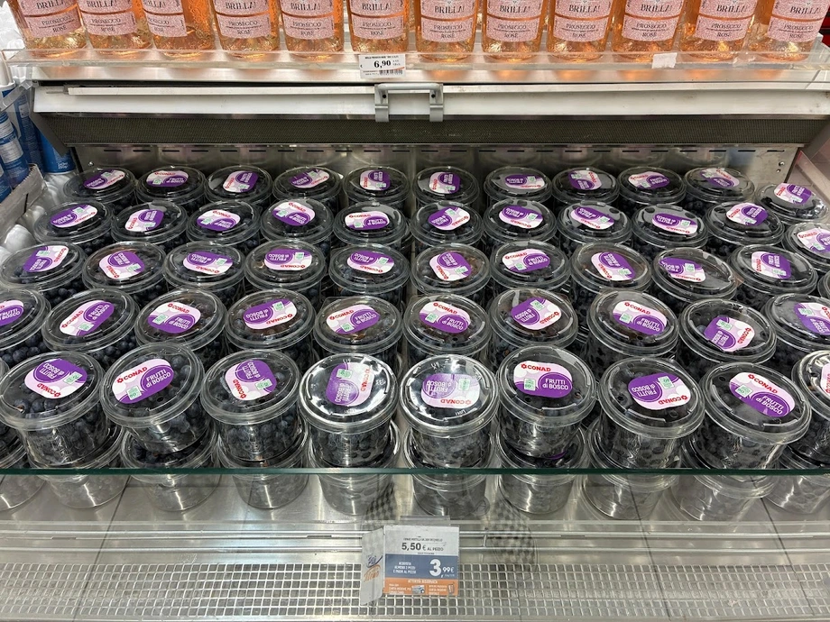
For berries, where many products look similar on the shelf and communication is confined to a small area of packaging, these details can carry considerable weight. Consumers do not simply buy fruit: they quickly interpret the origin, identity, promise and reliability of the brand offering it.
Italian Berry - All rights reserved